Are you looking to create a visually appealing space? Color schemes can help you. Colour Planning is a key part of interior design. We follow different types of Color Design Principles: Primary colours Secondary colours Tertiary colours Complementary colours Monochromatic colors Warm colors 60-30-10 rule Analogous colours Lighting And Neutral colours. Whether you’re redesigning your- Living room, office, or bedroom! “Charuta Plus” will give your desired space a soothing look- With the help of color psychology. You will be bound to be satisfied. So why are you late? Let us redesign your dream space with “CharutaPlus.”
Are you looking to create a visually appealing space? Color schemes can help you. Colour Planning is a key part of interior design. We follow different types of Color Design Principles:
Whether you’re redesigning your-
Living room, office, or bedroom! “Charuta Plus” will give your desired space a soothing look-
With the help of colour psychology. You will be bound to be satisfied. So why are you late? Let us redesign your dream space with “CharutaPlus.”

Creating the right mood begins with the perfect colour scheme. We use the colour wheel to explore options like-
primary colours
complementary colours
and analogous colours.
At Charutaplus, we customise palettes that match your style. Our mood board helps you visualise the perfect combination for your-
living room
bedroom
or any space.
You can choose from warm colours for energy or cool colours for calmness.
You will find the perfect balance with our colour palette. Charutaplus uses paint colours that reflect your vibe.
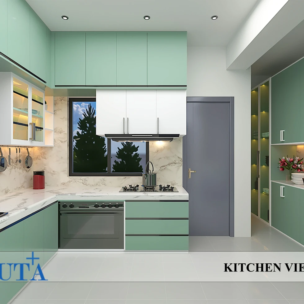
The right colour palette brings warmth and charm to any room. We create colour harmony across your space, from neutral to secondary colours.
Whether you prefer a minimalist design or a boho feel! We have a palette to suit your unique style. Explore
Split complementary
or analogous colour
To enhance your furniture and room ambience.
Accent colours are an easy way to add interest. We follow the 60-30-10 rule. It will bring life to your walls, furniture, and decor.
You can experiment with dark accent colours or vibrant green hues for a pop of energy. Complementary colours create stunning contrasts, while accented neutral colour palettes add sophistication.
Upgrade your living rooms or any other space with bold, statement-making accents.
Simple Colour Touches That Make a Big Impact
Small colour changes can have a significant impact. You may add a touch of glam with rich shades or a modern, sleek look with monochromatic schemes with us.
Charutaplus "Tetradic colour combinations"!
Or a more subtle approach with neutral tones! It will give your space a fresh update without overwhelming it.
Our Colour contrast will help you highlight features and create visual interest.
Achieving colour harmony is essential for a balanced interior. We offer various solutions, from split complementary palettes to double complementary schemes.
That will fit perfectly with your furniture and room design.
Whether you love cool colours! Or prefer a warmer palette! We are here for you.
Learn How to Combine Colours for a Seamless and Beautiful Look
Combining colours correctly requires understanding saturation & value. Our team uses the colour wheel to combine shades with ease. Whether you want to explore analogous colours for a smooth flow!
Or a more dramatic look with tetradic schemes!
Stay in tune with the latest seasonal colour trends. We incorporate fall colours like deep oranges! Earthy tones for autumn warmth!
Or vibrant spring palettes for a fresh, lively feel. Also, charutaplus adds paint and room-friendly colour schemes-
To update your space with the changing seasons.
Here are some of the best colour palettes for your Interior design -
We offer customised colour palettes designed-
To reflect your unique style and preferences. From mood boards to professional colour theory for interior design-
Charutaplus delivers personalised colour solutions. That will redesign your home or office or your dream space.
We have a group of skilled and experienced interior designers.
Explore our expertise in colour combinations for home interiors and eclectic colour schemes.
Let “Charuta Plus” Upgrade your space with the perfect colours—
We create vibrant, harmonious, and functional interiors. That speaks to your soul.
Colour theory works by understanding-
how different colors interact with each other
To create harmony, contrast, and balance.
It helps create visually appealing designs.
That evokes the right emotions and harmony.
Pick colours that reflect your-
personality
enhances the space
and creates a welcoming atmosphere.
A colour palette in interior design is-
A curated set of colours is used to create harmony and set the tone of a space.
The 60-30-10 rule is a design guideline-
Where 60% of a room’s colours are dominant
30% secondary
and 10% accent for balance and harmony.
আপনার ব্যক্তিগত স্টাইল, স্পেস এবং চাহিদা অনুযায়ী শুদ্ধ এবং সমন্বিত রঙের নির্বাচনের মাধ্যমে অভ্যন্তরের সৌন্দর্য এবং আরাম উভয়টিই নিশ্চিত করা সম্ভব।